The cold war maps that can help us rethink today’s Arctic conflict
Donald Trump grew up in cold war America. Maps of the time had an overtly political purpose.
James Cheshire, Professor of Geographic Information and Cartography, UCL
28 January 2026
The late 1940s and early 1950s were a golden age for polar mapmaking in the US. Major magazines such as Time, Life and Fortune commissioned a generation of famous cartographers – who had come of age in the second world war – to explain the new geopolitics to a mass audience that was highly engaged after the catastrophic global conflict they had just lived through.
Their maps were large, dramatic and designed to be spread across kitchen tables and classroom desks. And they also offered a very different perspective to the mainstream maps we have become accustomed to today.
I’ve spent the past four years unearthing maps from the late 1940s and early 1950s to research a book about a largely forgotten map library at my university, and I am always struck by how consequential they feel to the global arguments of their era. Not least because they invited debate from their readers who were asked to become global strategists by discussing the next moves in the game of geopolitics.
These maps didn’t just illustrate the world – they implored people to think about it differently. As the world enters a new period of international relations and global tensions, it’s worth considering the different perspectives maps can offer us.
With each new US foreign policy intervention – such as the US president’s current preoccupation with taking over Greenland – I have often wondered if these maps of global adversaries could have percolated into a young Trump’s mind. The world must have seemed a menacing place and it is shown on these maps as a series of threats and opportunities to be gamed, with the “Arctic arena” as a major venue.
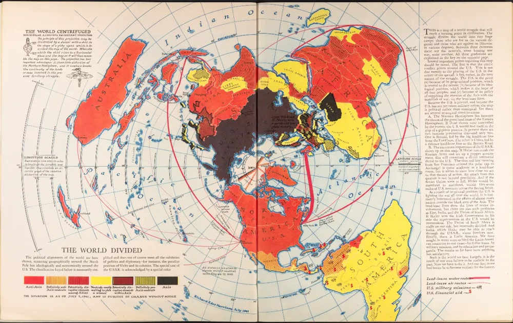
The World Divided is an iconic map showing the geoopolitical situation at the height of the second world war. It was created by Richard Edes Harrison and published by Fortune Magazine in August 1941.Cornell University – PJ Mode Collection of Persuasive Cartography.
The consensus encouraged by the maps was that of alliances, most notably Nato, and US opinion tended to endorse what Henry Luce, the influential owner of Time and Life magazines, called the “American century” in which the US would abandon isolationism and take on a global role.
Published in 1950, this map introduces the Azimuthal Equidistant Projection to Time Magazine’s readers.Time Magazine
Whatever one thinks of that worldview, it was frequently framed in terms of collective responsibility rather than individual dominance. Luce argued that the “work” of shaping the future “cannot come out of the vision of any one man”.
As we can now see with Greenland, Trump has taken the geography of threats and opportunity shown on these influential maps but reached a very different conclusion: an “America first”, resulting from the vision of the US president himself.
Dawning of the ‘air age’
The skilful of the cartographers of the era played with a range of map projections that offered different perspectives of geopolitical arenas. The master of this was Richard Edes Harrison who is described by the historian Susan Schultern as “the person most responsible for sensitizing the public to geography in the 1940s. [The public] tore his maps out of magazines and snatched them off shelves and, in the process, endowed Harrison himself with the status of a minor celebrity.”
Edes Harrison adopted many projections in his work – but for maps of the Arctic, he alighted on the azimuthal equidistant projection. While this creates maps that distort the shapes of countries, it enables the correct distances to be shown from the centre point of the map.
The projection became widely used in the 1940s and 1950s (and was indeed adopted for the UN flag in 1946) because it proved effective at demonstrating the wonder of the burgeoning “air age” as commercial flights followed great circle routes over the Arctic.
The Air Age Map of The World, 1945 (centered on London).The Library of Lost Maps
This contrasted with the roundabout routes that needed to be followed by ships and it also mapped the countries that bordered and occupied the Arctic with a much greater sense of proximity and threat.
Missiles and bombers were just as able to travel over the top of Earth as were holidaymakers – and this created a juxtaposition exploited by cartographers. Rand McNally, a renowned map publisher, for example, published a collection of maps entitled Air Age Map of the Global Crisis in 1949.
These set out “the growing line-up of countries and peoples behind the two rival ways of life competing for power in the 20th Century” – that is capitalism as embodied by the US and Soviet and Chinese communism.
Those who bought it were told: “Keep this map folder! It may have great historic significance a generation from now.”
This 1950s map published by Rand McNally was produced as part of a marketing campaign for Airwick air freshener, but also sought to inform the US public about the spread of communism.Rand McNally
New world order
Donald Trump’s return to office has revived talk of a world moving beyond the assumptions of the postwar order — weakening alliances, acting unilaterally, treating territory as leverage. At the same time, maps remain one of the most trusted forms of evidence in public life.
A Mercator-shaped worldview, widely used by digital maps can distort reality – for example, making Greenland much larger than it is.
Cartographers have long known the strengths and limitations of Mercator, but Trump’s approach to foreign policy is a further reminder of the perspective we lose when we depend on the standardised views of Earth that digital maps encourage (some have also speculated that Mercator’s exaggeration of Greenland’s area heightens its real estate appeal to Trump).
Maps are powerful things and in times of crisis, or rapid change, we turn to them to help explain events and locate ourselves within them. But they can be just as much about arguments as they are facts – and Trump knows this.
The maps of the 1940s and 1950s were about a fresh (American) perspective to create a new world order. They instilled Trump’s generation with a sense of the geopolitical rivalries that tend to get washed out of generic digital maps that are most widely consumed today.
Nearly 80 years on, this order may be creaking – but the maps are still there to remind us of what’s at stake.
James Cheshire receives funding from the Economic and Social Research Council.
This article is republished from The Conversation under a Creative Commons license.


